


The Perla, Provost, and Murray Triplet
In 2011, Perla, Provost and Murray published an article that promotes the use of run charts as an accessible and powerful tool[1].
The body of the article describes simple probability-based rules to identify unusual patterns of runs in time-series plots. Unusual patterns that correspond to intentional actions provide evidence of causal impact.
The authors make a compelling case for plotting data in time-order rather than relying on summary values of performance before and after a change that is intended to improve performance. They show a triplet of graphs that have the same summary statistics for values before and after the change. However, the graphs show very different patterns. Only one graph appears to unambiguously correspond to a simple interpretation that the change causes a step-change in performance.
The Perla, Provost, and Murray presentation recalls the graphical example provided by Frank Anscombe, known as Anscombe’s quartet: four graphs with very different appearances that yield the same statistical summaries. Click here for a description of Anscombe’s quartet.
I created an RMarkdown script that generates examples similar to the Perla, Provost and Murray triplet. Starting with 24 random numbers divided into two batches of size 12, the script allows the user to create graphs with “up” or “down” as the better direction and to customize variable name and unit label to match the user’s applications.
You can interact with the script here. The code for the interactive script, the script that produces the draft of this blog post and a script that produces a simple PowerPoint presentation with the same content are saved on Github, here.
The message in the triplet of graphs: Teaching Points
Measurement as a guide to operations control and improvement
Why plot dots from your operations in time order? The plots help you see whether your operation continues to perform as expected or shows effects of unplanned changes in performance. If you are making purposeful changes to operations, do these changes drive changes in the patterns of the dots?
Plotted numbers help answer Question 2 of the Model for Improvement.
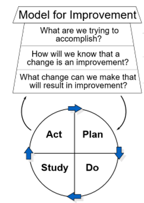
developed by Associates in Process Improvement
The Set-up of the Triplet
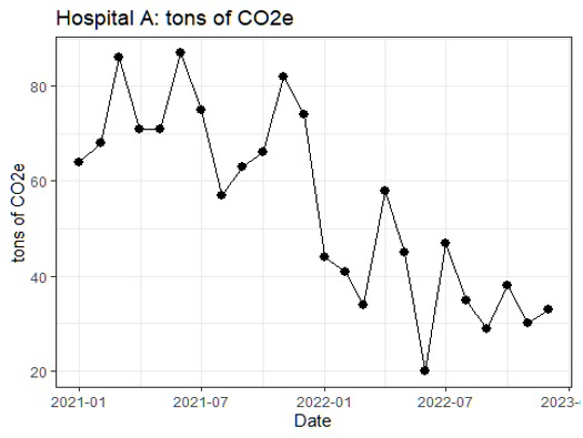
The simulated situation: units A, B, and C each have summarized the performance associated with their operations month by month in 2021 and 2022.
Each unit tested and changed operations in December 2021, with the aim of improving performance. In this case, reduced carbon emissions, measured by tons of CO2 equivalents (CO2e) represents improvement.
Each of the three units produces exactly the same summary performance.
Does it look like reviewers should get excited about the impact of December 2021’s change?

Plot the Dots
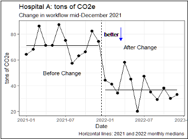
Unit A: What do you see in the data display?
The time series graph for unit A shows the monthly values summarized in the table above.
Does the graph support the belief that the change in December 2021 improved performance, 2022 vs 2021?
Unit A’s graph, with a step-change in the better direction, seems like the graph many of us would expect to see in light of the summary table.
Add labels to make it easier to see the story in the numbers!
Does the graph support the belief that the change in December 2021 improved performance, 2022 vs 2021?
Add words, the line to mark the change in workflow, the median 2021 and 2022 values, and the “better” direction arrow to help you contrast your belief with the data.

Unit B What do you see in the data display?
Does the graph support the belief that the change in December 2021 improved performance, 2022 vs 2021?
How does the pattern in this graph differ from the graph of unit A’s data?
While Unit B has the same summary statistics that might support improvement in 2022 versus 2021, the graph tells a very different story.
The pattern in the graph for Unit B suggests that improved performance is not associated in a simple way with the change in December 2021. The change in December 2021 may not have anything to do with the improvement.

Unit C What do you see in the data display?
Does the graph support the belief that the change in December 2021 improved performance, 2022 vs 2021?
How does the pattern in this graph differ from the graphs of data from units A and B?
The pattern in the graph for unit C is easily recognized: a temporary improvement associated with a change and then decay in performance. Turnover in staff who use the change, shift in management priorities, fatigue from extra effort to support a temporary fix are just a few causes that people offer in describing the pattern in this graph.

In our collaborative work, we often compare related units in one display
You can shrink graphs to show several in one display; it helps if the scales are all aligned.
You can quickly compare patterns and look for differences.
Here’s a stack of the graphs from units A, B, C.

[1] Perla, R. J., Provost, L. P., Murray, S. K. The run chart: a simple analytical tool for learning from variation in healthcare processes. BMJ Quality & Safety, 2011, 20, pp. 46-51