


Rank and Funnel Plots
Do physicians differ with respect to patient responses to the question, “My doctor(s) showed concern and sensitivity to my needs.”?
Using Physician Data to Improve System Performance
It's easy these days to create plots and tables, often organized in dashboards, that compare group or individual physician performance.
The most obvious displays based on rank ordering of performance may or may not help physicians improve performance. In many cases, the usefulness of a data summary depends on the strength of the evidence. For survey data or percent compliance with defined best practice, this means paying attention to “n.”
Here is a summary of a data table of patient responses to the survey question about physician concern; patients could choose from five options, ordered from worst to best performance. The best or “Top Box” answer is “Strongly Agree.”
| Phys. ID | N surveys | Count Top Box | % Top Box |
|---|---|---|---|
| 4 | 2 | 1 | 50.0 |
| 12 | 11 | 9 | 81.8 |
| 15 | 15 | 11 | 73.3 |
| 21 | 13 | 11 | 84.6 |
| 1 | 22 | 18 | 81.8 |
| 8 | 21 | 16 | 76.2 |
| 19 | 23 | 18 | 78.3 |
| 17 | 25 | 21 | 84.0 |
| 7 | 22 | 20 | 90.9 |
| 10 | 27 | 19 | 70.4 |
| 13 | 23 | 15 | 65.2 |
What is a Good Way to Make a Graph that Can Support Action to Improve Physician-Patient Communication?
A simple rank order plot of the Top Box (TB) performance encouraged one manager to suggest that physicians with low scores, e.g. physicians 13 and 4, could improve performance by figuring out what the physicians are doing who get high scores e.g. physician 7.
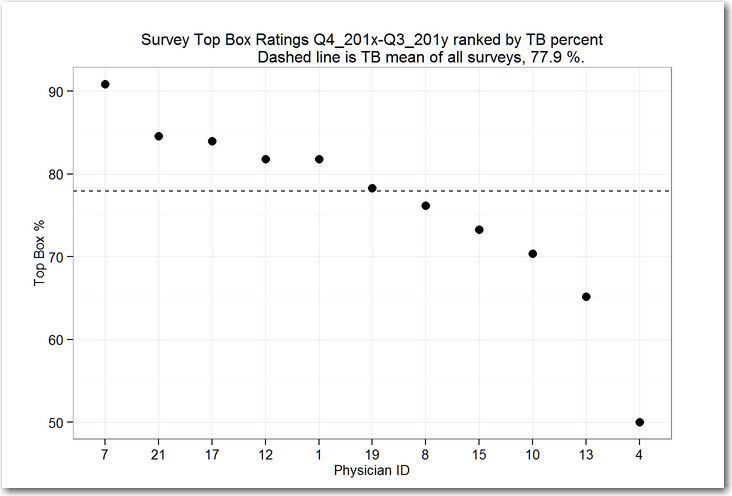
This plot doesn’t take into account the different numbers of surveys returned for each physician. Referring back to the data table, Physician 4 had only 2 surveys returned; perhaps the evidence in the Top Box counts ought to be weighted by the number of surveys!
So let’s add a plot of the number of surveys to the display to guide our interpretation.

Let's set aside physician number 4, two surveys are too few to tell us anything useful. What about physicians 7 and 13? They have about the same number of surveys (22 and 23) but physician 7 has 90.9% Top Box while physician 13 has only 65.2%. Is it a high-odds strategy to have physician 13 try to figure out what physician 7 is doing differently?
Control Chart Arithmetic: The Funnel Chart
An alternative display uses the survey counts to help us identify physicians who might be considered special relative to their peers.
We use a control chart calculation to indicate limits of expected variation in the Top Box rates, comparing individual Top Box rates to the overall mean Top Box rate.
Points falling outside the limits indicate physicians whose practice is very likely to be different in important ways from their peers; chances are that we can find differences that matter without getting fooled or losing our way.
This kind of chart is called a funnel chart; here’s a reference: The Health Care Data Guide: Learning from Data for Improvement, Provost and Murray, 2011 Jossey-Bass, chapter 5, http://www.wiley.com/WileyCDA/WileyTitle/productCd-0470902582.html
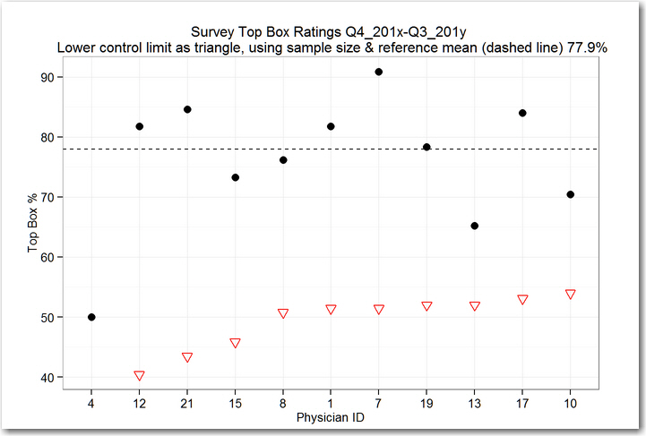
When we look at the funnel chart, we see that all of the points are above the lower control limits, marked for each physician as an open triangle.
The conclusion is that none of the physicians are unusually different in Top Box rating for this survey item, based on the number of surveys we’ve collected.
Telling physicians with low scores to find out and then apply what physicians with high scores are doing is likely to be a waste of time--we won't easily find useful differences associated with specific physicians. A hunt for special differences may even add more waste in the system by increasing variation among physicians who are tempted to change their practice.
A better approach to improve performance in this case where we see no compelling differences in scores: agree to a standardized communication practice for the entire physician group and then work to have all physicians use that method. (This was the approach used by the physician group whose data I've summarized--"we're all in the same boat, what can we do together to improve?").
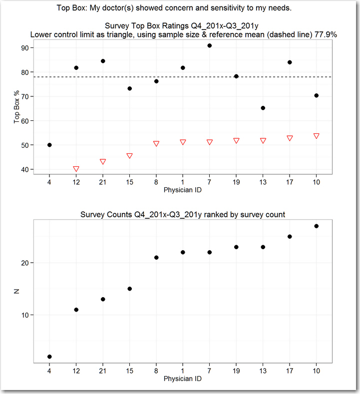
Although the survey counts are included in the calculation of the lower control limits, it is easier to understand a plot of the counts themselves. So we can combine the funnel chart with a plot of the survey counts to help us relate the sample size to the funnel limits.
In this example, note that no limit is shown for physician 4--the control chart calculation indicates that 0%, 50% or 100% are all plausible results for just two surveys, which matches our gut-level decision to set physician 4 aside.
Why No Upper Control Limit? The Funnel only Has a Bottom Edge!
In our example, the calculated upper control limit for each physician is greater than 100%, so we interpret the display to say that that any of the physicians could have a perfect 100% rating given the survey counts and that still would not be a basis to declare special performance for the survey counts we’ve got.
To illustrate the effect of sample size on the funnel chart, let’s increase the number of surveys by a factor of 6, holding the percent Top Box the same as in the real data set.

Now we see the funnel shape emerge, with the solid triangles forming the upper edge of the funnel and the open triangles forming the lower edge of the funnel.
The interpretation of the display changes. We have evidence that physician 7 is performing above the group, while physician 13 is performing below the group. While physician 4’s score is below the score of physician 13, physician 4’s score is inside the funnel, so there’s no special reason to focus on physician 4.
Conclusion
When you look at rank order of physicians based on counts of cases or surveys, it pays to keep track of "n." A funnel chart accounts for n in a way that can guide improvement, reducing wasted effort.

